Saturday, 26 December 2009

Spanish navvies required?


Boxing Day in the local job shop window. I wonder if they tried calling Fawlty Towers first?
Friday, 18 December 2009

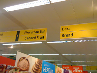
What is aisle 7 in Welsh?


On a visit to a supermarket in Cardiff this week the redundancy of bilingual signs became obvious. Here at Morrison's, lost Welsh mono-lingual souls can buy pysgod, but they will never find the eggs, will they?

They'll miss the special offers and undoubtedly have to pay more. This is surely discrimination?

But it was good to see that there can be no confusion over fizzy drinks: Cola translates on the board below as Cola. And the hippies can buy Miwsli, but will never really know if it's naturally healthy, because they won't find a Welsh speaker on the tills.

Then, drive out of the Car Park (Parc Bang-bang) to try to make sense of the typographic, illegibility and road safety nightmare that is caused by the road signs.

What to choose to visit Gavin & Stacey (or should that be Gafin a Staci?) - are they in Barry or Y Bari? I'll try both just in case.

Take down the English signs and make the customers learn to speak proper...

Reminds me of the old joke that has the punchline:
Wrexham? Bloody ruins 'em.

Thursday, 17 December 2009

Good King Wenceslas


When the snow lay all around, deep pan, crisp and even...

Saturday, 12 December 2009

Wibble wobble wibble wobble - jelly on a plate


Jamie Oliver rounds off the week with a very nicely cooked piece of wrapping paper. Not only is he a good cook, but he's a dab hand with Photoshop too.

I read today that he's made £83m this decade from his books. Not bad for someone who says he's never read a book.

Now for the next decade... what to do?

Friday, 11 December 2009

Graffikeristmas


A Christmas tree with letters for lights! How graphic can it get?

I couldn't get the lights to spell anything as I draped them around the tree, but if I had, it would have wished you anything you wish yourself.

Wednesday, 9 December 2009

Looking at the stars


The image I chose for my Christmas card this year is one from several I took (from the gutter) at the base of the chimney at Salt's Mill in Saltaire. (I don't care if they have abandoned the apostrophe on the building and in the shops and cafés. Titus Salt was his name, so his mill is Salt's Mill. Don't get me started Betty).

I'd wondered why I'd missed these starry railings in the past, but have come to the conclusion that every time I have passed in the past I've either been looking up at that chimney or the rain and wind has been so bad that I was walking with my head down.

I'm glad the sunny day allowed me to see the shadows of the stars from the gutter.

Perhaps that's where Oscar Wilde was the day he said that? I hope he had a nice pot of tea in Salt[']s Diner.

A Desmond


Not bad paper for someone who got the degree that everyone dreads: a 2.2! Desmond's doing very well in his new role as designer.

Be worried, be very worried. Runcie's just bought some magic markers.

The H factor


What are 'hsolicitors' and 'estatehagents'?

Reminds me of Prince Buster's 1964 Ska classic that begins 'Al Capone guns, don't hargue'. And hey, Jeremy [Mr Hopkinson], where's the hapostrophe?

Signsofthetimes?

Tuesday, 8 December 2009

All wrapped up


So, Lily Allen is designing wrapping paper, and we've also had Helen Mirren and Nicole Kidman's gift wraps, to be followed by Desmond Tutu!

So when I saw recently that Peter Saville had done some wrapping paper for Manchester, I'm wondering if I didn't misread it. Perhaps it was Jimmy Saville?

Peter Saville's a singer with Factory Records isn't he?

Wednesday, 4 November 2009

Upstate Yorkshire


Harrogate is perhaps best known for Betty's tea rooms and the Turkish Baths (and, of course, the world-famous design consultant who lives there), but this shot in the late autumn afternoon sun made me feel more like I was in New York in one of those cross streets in Midtown past Fashion Avenue. The yellow cabs and the water towers were missing, but otherwise...

Odeon architecture (conveniently blocking out the new Odeon branding in my shot) topped with a lovely piece of art deco lettering. Even the blue neon stripes look good. Try getting Bloggs Signs to space letters like that now... You can't, can you?

(with apologies to any sign company actually called Bloggs, it's not you, this one is an imaginary company responsible for the sign ills of the World.)

Friday, 23 October 2009

Hairdressers' hair

At long last I have got around to posting a holding page on my website - I make a business of advising clients that they should have a website amongst other things. You know, like the way hairdressers always have awful haircuts because they never get around to doing their own.

Yesterday, having had all sorts of problems with the mechanics of uploading the page owing to a highly obstructive process by mine host BT Business, I jokingly made a comment to the effect that like decimal money the interweb is never going to catch on, which prompted Victor Brierley to respond with 'bet you 10 bob it does'.

Anyway, see the wood and the trees on:
www.minards.co.uk

Tuesday, 29 September 2009

Don't you just love the iPhone?


All done on the iPhone in my siting room from the comfort of my Ligne Roset Togo sofa. The iPhone is more than a phone, it's a timewarp in which one can produce photographs they didn't know were possible.

Even the Garden sign in the previous post was done with my iPhone pretending to be a Polaroid. Ironic given that the last batch of Polaroid film is about to expire.

Wayfinding and orientation


We were in Ilkley in Yorkshire on Sunday for a genteel stroll and tea in Betty's (I refuse to omit the apostrophe like they do). I'm sure that all Ilkley residents will recognise grass and flower beds as a garden, but the town has been really kind in labeling it as such for visitors from the concrete jungle.

However, I was nearly run over on leaving the garden as they had omitted to label the road.

Thursday, 17 September 2009

A warm welcome a long way from home


There I was giving a lecture on national branding during the week I spent as a guest of the School of Art and Art History at the University of Florida when I felt a hot flush coming on.

Nerves? No.

My friends in Florida had checked out my passport and realised that it was my birthday. Where they got all those candles from I'll never know, but the flames on my surprise cake as it was carried in very nearly caught the attention of Steve McQueen and Paul Newman fresh from Towering Inferno. Florida must have suffered a birthday candle shortage for months after.

Don't try and count the candles, please. I believe the blaze was visible on Google Earth.

But what a lovely surprise. I'll always remember that.

Friday, 4 September 2009

Notting Hill gates


Whoever stole Alan Fletcher's original Victorian gates from outside his Notting Hill house did the design world a favour.

Fletch's replacement gates were made to his own alphabet design and demonstrated that it is possible and necessary to think differently when confronting an obvious brief.

Fletch's take on the Thomas Crown Affair


Watching Pablo Ferro's title sequence for the original The Thomas Crown Affair (see the previous post below) I was reminded of Alan Fletcher's poster for the National Portrait Gallery in London which juxtaposes rectangular fragments of portraits from the gallery's collection to create an irreverent caricature of the Prince of Wales (should there ever be anything other than irreverent for Charlie boy?)

Fletch's poster was again a brilliant piece of creativity amazingly well-seen.

Watch the YouTube clip and spot the similarities, quite coincidentally.

The decider


What made me really decide to become a graphic designer? The Thomas Crown Affair in 1968. I was excited about the split screen motion in the titles and throughout the film. So very basic now, I had never seen anything like it as a 17 year old.

Pablo Ferro created the graphic design and optical effects in the 1968 film. Ferro used a variety of techniques: forming a larger image out of smaller sub-images, moving the subframes, changing the tint colors of the subframes, duplicating the same image within multiple subframes, and so on. The edgy, jazzy score by Michel Legrand complemented the rhythmic visual editing.

Why I did not pursue a career in film titles I will never know, but the titles of the film and the presence of Steve McQueen, the coolest man of the 20th century, certainly sent me in the direction of graphic design. Well, a career as Steve McQueen was impossible.

Take a look at the titles on YouTube (with Legrand's Windmills of Your Mind sung by Noel Williamson):
http://www.youtube.com/watch?v=ELgjuHTbT3o

It still makes me excited (but I don't get out much - he world has changed from black and white to colour since then and it's a bit too bright for me).

What was my first design influence?


As a small boy I used to accompany my Mother to a minute, private library near home. For a few pennies it was possible to borrow from a limited range of novels, and my Mother was (and still is) an avid reader.

As she browsed the shelves, I recall waiting near the owner's desk upon which was an ashtray bearing the Dunhill logotype. I became fascinated with the elongated ascenders of the d,h and l and its radically modern appearance in amongst the very traditional dust jackets.

I lived then in a world of tobacco smoke, and the library was no different. The owner sat chain smoking as her customers browsed. The Dunhill ashtray was a necessity and its graphic influence may well have set me on my typographic career journey.

Paul Rand - using the language of the poet and business man


I had the great pleasure of meeting Paul Rand at IBM in the 1980s.

It was daunting to meet one of the godfathers of design. Focused, astute and a strong advocate of attention to detail, Paul Rand worked with some of the World's largest corporations - IBM, Westinghouse, Ford and many more. He had a lot to offer in relation to my work and his influence on me will never be forgotten.

Steve Heller described him as “an enemy of mediocrity, a radical modernist”. Just before Rand died in 1996, Steve Jobs, who had been a client at NeXT Computer, said that he was 'the World's greatest living graphic designer'. His inclusion in Apple's Think different advertisements bore this out. Picasso was another different thinker chosen for this series.

Moholy Nagy said of him early in his career: 'Among these young Americans it seems to be that Paul Rand is one of the best and most capable […] He is a painter, lecturer, industrial designer, [and] advertising artist who draws his knowledge and creativeness from the resources of this country. He is an idealist and a realist, using the language of the poet and business man. He thinks in terms of need and function. He is able to analyze his problems but his fantasy is boundless'

His contribution to the development of corporate identity from its beginnings in simple trademarks to the sophisticated machine that it is today was immense. His input was from a time when design mattered immensely and his brilliant use of what one perceives as simplicity (but which was not) made him one of the major influences in design in the 20th century.

Fletcher/Forbes/Gill


Alan Fletcher, Colin Forbes, Bob Gill

These fellows were responsible, almost without rivals, for the birth of modern graphic design in the UK. Fletcher/Forbes/Gill became Crosby/Fletcher/Forbes, which became Pentagram.

Like the Beatles of design, they broke new ground. They did things differently.

The rest is history. We owe them a lot.

Sunday, 30 August 2009

South Wales Pullman - a real brand


Imagine the sight of the mysterious, shining, all silver South Wales Pullman gliding, almost silently, into Cardiff General Station en route for London Paddington. The doors are already open before it comes to a halt and a uniformed steward is standing at each one, a freshly laundered white linen cloth draped over their arms welcoming on board only the most important of first-class passengers for a silver-serviced breakfast. The likes of Richard Burton and Elizabeth Taylor, Stanley Baker, Shirley Bassey, Tom Jones and Honourable Members of Parliament traveling back to London after a weekend with family.

That really was a BRAND, a mystery to the holders of second-class tickets, and one to which they may wish to aspire. As a humble, lowly-ticketed student I waited patiently for the next, dowdy, over-heated diesel train.

Which company ran the South Wales Pullman? What was the symbol on the side of the carriages? It really didn't matter. Silver, mystery, the efficiency of the staff, white linen - they were the brand experience to the outsider. In reality, the operating company was the only one in the UK - British Rail and the symbol was probably the Design Research Unit's excellent there-and-back rail mark (still used to tell the UK where a railway station is, a testament to the power of that long-gone brand).

Years later I used the (non-sliver) Lancashire Pullman regularly from Crewe to London Euston, but the reality of sitting with overweight and pinstriped Mancunians eating huge fried breakfasts in one long, first-class tickets only restaurant-car train came nowhere near the unattainable, silver South Wales Pullman brand I'd conjured up in mind.

Sunday, 23 August 2009

If it ain't broke


Computers are to design as microwaves are to cooking (Milton Glaser).

When Saul Bass designed the AT&T mark in 1984 he did a pretty good job (could he ever have done a bad job?)

AT&T says of its mark (in a 2005 statement):

Today's shift to a new brand and a new look symbolizes the strategic transformation under way at the new AT&T. It also reflects the fact that, while our brand has a long and proud heritage, the attributes that bring it to life for our customers are as fresh and new as ever," said Edward E. Whitacre Jr., chairman and CEO of AT&T Inc.

The revitalized mark symbolizes these attributes — innovation, integrity, quality, reliability and unsurpassed customer care," Whitacre added. "Our customers know that we're focused on keeping our promises, committed to operating honestly, and dedicated to bringing them new products that make a difference in their lives.

Lowercase type is now used for the AT&T characters because it projects a more welcoming and accessible image.

Nearly quarter of a century on, could it be that AT&T was wrong? Does the verbal description match the picture?

Was it really broke? No, of course it wasn't.

Monday, 17 August 2009

The most beautiful car in the World


And why? The DS was a huge leap in car design, functionally and visually. Is there any wonder that the crowds were impressed at the 1955 Paris Motor Show?

I rode in a DS just once (in the mid 1970s) and do you know what impressed me the most?

Well, the external shape was one thing, the bench seats another, but it had to be the steering wheel. Amazing.

The power of design.

Staycation


The second image by Cheryl Jenkins underlines the thin veneer of the brand of the British seaside. While Butlins opens a £20m hotel in Bognor Regis and the Midland Hotel in Morecambe is returned to its Art Deco splendour woe betide those who take a stroll outside the confines of their accomodation.

Mind you, £1.50 for a jug of tea is a real bargain. Come on you American tourists - buy in to a piece of the brand that is old England. A real English tea room.

Had the government thought it through it would have subsidised holidays on bargain airlines to warm places where chilled beer is available to the recession-hit British public instead of suggesting hot BBQ weather and stay-at-home vacations. A staycation tonic to the nation bolstered by the belief that HM Government is looking after us by stockpiling Tamiflu simply has not worked.

The first image is what one experiences at the height of the summer season in Saltburn by the Sea in Cleveland. Empty beaches, a wet day and very little else in the way of fun (although the machines in the arcade for taking huge numbers of twopenny pieces from us were a bit of light relief, as was the Funicular railway up to the town, twinned with any desolate Eastern European town that you can imagine). That evening we stayed inn over-priced 4-star country inn and had the experience of sending back an entire meal for the first time in our lives!

The brand of Britain that is mass tourism sits firmly in the cities where galleries, cafés that are open and serve edible food, hotels etc exist! There is a long way to go before we can compete. We venture in search of £1.50 jugs of tea in the belief that we should do for the good of the country

Saturday, 15 August 2009

Catching the bus

Pirelli Slippers. The sheer vitality of this 1962 bus-side ad by Fletcher / Forbes / Gill remains unmatched in the history of graphic design.

The design by Alan Fletcher is brilliantly seen, enlisting the passengers on the Routemaster as live extras in the humour.

The work of Fletcher / Forbes / Gill was closely aligned with the culture of the time and its simplicity belied the high level of creativity that these influential men brought to the visual vocabulary of the 1960s.

The Hidden Persuaders


Vance Packard warned us what was going to happen. Reading this 1950s book again today provides the chilling view that we were falling into a brand chasm 50 years ago, and we knew it.

The Hidden Persuaders was published in 1957 and has sold over a million copies. It addresses the immediate post-war consumer situation, the beginnings of motivational research, subliminal activities in marketing and the manipulation of expectation and desire for new products.

These techniques were also applied to politics.

The early naivety of Packard's views have been discredited as marketing manipulation has advanced. What is important to bear in mind is that Packard was flagging the activities for the first time.

Looking back, the whole issue of mass market motivation, the development of new consumer product desire and the ability to see the 'state we're in' in hindsight, the book is well worth revisiting for all of you who have not read it.

Sunday, 9 August 2009

Ugliness does not sell. RAYMOND LOEWY


Say it again Raymond.

Ugliness does not sell.
RAYMOND LOEWY

The vagaries of language


Whenever two languages meet there will be a double meaning that is noticed by someone. Thanks to Kev Coatman for noticing this on the way to Tokyo.

MIN2U

MIN2U: why pretend to be text-cool with a business name that makes brand sense only to a rap singer? Have we lost the will to read real words? Sry - hv we lst the wl 2 rd rl wds? :(

Tuesday, 4 August 2009

Pru Freida


How many times do we have to remind ourselves that the outward face of a brand can say different things to different readers. Is there anyone in MultiYork who has seen this and made the decision that accuracy is so yesterday? At least the sheet of paper fits in the display unit - or will that not matter when it happens?

Wednesday, 29 July 2009

An improvement?


BMC - The Austin Seven. Shaky, leaky, not too good in the wet (it kept cutting out). But a cross-class leveler used by Royalty, Stars and The Common Man. Sliding half windows at the front. Affordable by many.

So what did we do? The Mini brand was so strong that it was applied to a car that is not that affordable, is in no way innovative, is cramped in a new way despite being so much larger and so much faster.

What a pity that Alec Issigonis's 1959 - 2000 flawed masterpiece became the flawless, electric-windowed piece of retro nostalgia that it is today. And let's not get started on the Fiat 500.

Monday, 27 July 2009

Making businesses design ready


This article is the basis of two features published in the Business Pink supplement of the Harrogate Advertiser last Friday:

Making businesses design ready

Brian Minards is a Harrogate based, independent consultant operating in the area of business integration, new product development, corporate and brand strategy, creative direction, and design management. He is a past Vice President of the Chartered Society of Designers, an academic, and a past director of WPP, a World leader in marketing communications.

Three years ahead of the economic downturn, The Cox Review of Creativity in Business expressed the importance of creativity, design and innovation to business performance and the UK economy. Sustained success in business, regardless of sector, Cox said, increasingly depends on the ability to innovate: to exploit new ideas and new opportunities ahead of the competition.

The Design Council maintains that to survive in challenging economic conditions and stay ahead of overseas competition, UK businesses must add value – designing innovative products and services instead of cutting prices. Design is a significant source of competitive advantage. Companies that invest in their design capability and develop a reputation for innovation can avoid competing on price alone. In the UK, 45% of firms that do not use design compete mainly on price; only 21% of firms where design is significant do so.

The Design Council’s research finds that for every £100 a design-alert business spends on design, turnover increases by £225. There are many instances where this success can be measured and evaluated, making design a tangible asset to any company.

Embedding design at the heart of a business’s strategy is crucial, but where do businesses look for advice and support in this minefield? Clearly, directly approaching design suppliers without a wider knowledge of the ways in which they may integrate with your business is ill advised. A current support scheme for businesses is Designing Demand, a programme managed nationally by the Design Council and delivered by the RDAs and their delivery partners. Designing Demand has recently gone live across Yorkshire.

Design is no longer a cosmetic, superficial bolt-on used to make products and services prettier for market, it’s firmly embedded in the operation of those UK companies that are growing.

The integration of design at all levels – from corporate strategy, through products and services, to internal and external communication – is important to the wider success of a business.

Making businesses design ready involves the strategic management of design at board level, linking design and business to deliver service or product development across R&D, brand strategy and realisation, the marketing mix, environment (interior and exterior), engineering, and the manufacturing process.

The quest is to source a strategic design consultancy that understands this and will work with your business from the outset to identify direction and routes to market.

It is both possible and necessary to design our way out of the recession, ready and healthy to come out fighting at the other end.

© Brian Minards 30 June 2009

St Pancras

What was I thinking? Why can't all major railway stations in the be like St Pancras? And when I say railway stations, I mean RAILWAY STATIONS, not train stations.

A sense of place. A sense of arrival and departure. An operational precision that is long forgotten (if, indeed, it ever existed). St Pancras is a brand that defines UK railway travel. A home for that dream.

Steam! I recall duplicated notes handed out on school trips to London or Bristol on Great Werstern warning us not to hold our heads out of the carriage windows (and you could do) because 'a smut [in the eye] on the way can spoil the day'. A smut on the way can spoil the day.

Reminded of that smoky danger, I crossed the road to Kings Cross, which tells a different story, and returned via National Express to Leeds, walking past Starbucks, Wetherspoons and the like, housed in what was, and should still be, a great concourse and I was reminded that Mick Jagger once told me that you can't always get what you want!

Bendall's Tea

Bendall's Tea: the aroma of tea and roasting coffee on the corner of Gloucester and Sommerville Roads in Bristol for many years.

This sign stood proud on the prominent corner site for many years and represented quality of provisions and service until such a shop became outdated. Then, over 25 years ago, Bendall's closed and the shop became a carpet shop (and now 201 Gloucester Road is an estate agent), and the solid wooden sign (painted black in many coats over the years on top of the original gold leaf) was removed and lay discarded in the back of the shop until I rescued it and had it refurbished it to its former, gold-leafed glory.

The T-E-A letters are 3ft high, and the BENDALL'S letters are 12in high. It took hours to letterspace these on the wall in the picture.

A potentially forgotten Bristol tea brand lives on above my dining table in Harrogate, home of Yorkshire Tea!

National branding

Like the World Cup in England in 1966 and Concorde, some events define a nation for years to come.

Whether it was filmed in Hollywood or they actually landed on the Moon does not matter. America was first and it has not been repeated by any other country.

40 years on, the record remains. 40 years on the astronauts still hold a mystery and, though presidents come and go, the first men on the Moon have defined a nation's brand over and above so many more events.

Who knows? Whether or not that one small step for man ever took place, it does not matter. It is believed in by the majority over time, and that's exactly how brands work.

Thursday, 16 July 2009

The value of a good concept and an excellent brand

I went to hear Jim Averdiek, the founder of Gü, speak about how he did what he did and how it was such a success.

First, he'd thought seriously about the concept and the market, then he approached his brand design consultant to think about a name and the way in which the brand might be positioned.

Going back to the designers after a week, Jim was told that they'd researched the chocolate pudding market and there was already a company in Belgium that did what he wanted to do. They showed him what the company and packaging looked like and how he would have difficulty breaking into their market.

Seeing his disappointment, the designers admitted that they'd made it all up and that Gü was his for the taking.

Then he tested the market, found it viable and partnered with a manufacturer to make the product.

The rest is history - from £0 to £25m in six years.

Lucky or clever, or both? Innovative products and excellent brand strategy underpins the whole process.

Wednesday, 8 July 2009

What sort of zone?


What sort of zone is this in Praha? A haven for really bad icon designers or what?

PR or PR

This brand mark was made in the last century. The client was a PR company that wanted to break the stuffed shirt mode. Running badly behind with the deadline, I got up at 3am, drew the mark, designed the stationery range, brochure ideas etc, mounted the presentation and made the coffee just in time for the clients' arrival at 9am. They loved it!

This was before the Tories used it!

Tuesday, 30 June 2009

What a pain

Just off Charles Bridge in Praha is The Museum of Medieval Torture Instruments. Ouch!

Dead?


Michael Jackson dead? Why has there not been more in the media to tell us about it?

In between brands


The disappearance from the high street of the once proud Woolworth brand has left a gap in many UK towns where the retail sector is already struggling.

In Harrogate the store has already been taken by Boots.

The accidental interim brand, created by the removal of the Woolies letters and leaving the cables dangling looks better than many intentional signs.

What does it say? The shadows make new letters. Peer Poo? Now that's an idea for gardeners.

Sunday, 21 June 2009

Eau de Rail Nord

When you need to freshen up after a hot day, Northern Rail has introduced its new cosmetics brand. Yorkshire's answer to Issey Miyake?

Followers